The industry of web designing and development is an attractive section of today’s business world. Both businesses and experts are collaborating at different levels to take their businesses up to an extra notch.
That has resulted in the flooding of the internet with the end number of website, each trying to further its business online. However, many people equate success in the global marketplace of this age to that of having a digital presence. However, that is not all. To generate revenue through this platform, one has to attract customers with an optimized, functional and interactive website.
Presently, almost every business has a website of its own. Although, when taken into account, most of it falls short in regards to the technical and content requirements of a successful website. The clients, along with the developers, each contribute to the development of a poor website. That is the reason why the internet is flooding with poorly designed websites.
Often than not, clients tend to have unrealistic expectation from their websites. Their limited knowledge about the principles that make a website successful coupled with their preference for aesthetics over functionality, often, turns out to be a hindrance in the designing and development of a revenue-generating website. Moreover, their hesitation in investing in the development of a website constricts the designer’s creativity. It further, restricts the designer from applying all his technical knowledge to achieves all critical online marketing goals of a website. Besides, a designer is additionally able to design an inefficient website by describing the digital marketing must-haves of a successful website as just mere extras.
Designers and developers should enlighten their clients about the benefits of highly-functional websites. Businesses, as well as designers, should have awareness about the inescapable rules of 2019 for designing a website that helps them attain tangible results.
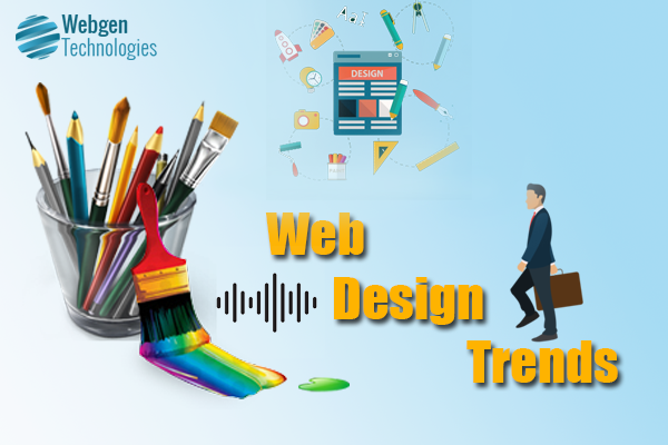
Easy tricks for designing a successful website
Websites are the new stores for any business. Be it an e-commerce website, a service-related website or a well-designed website. It is a valuable investment that will generate revenue for any business. Acknowledging the importance of a website in this new age of marketing that is focalising on forward-thinking marketing techniques, one requires to make sure that the highly valuable tool of contemporary marketing system suffices the fundamental requirements to become effective in the same.
The aesthetics of the same plays a prominent role in turning a website of a business into one of its most acknowledged assets, which help in generating revenue by attracting customers.
So here we are going to talk about a few dos and don’ts of web designing that any business intending to generate revenue from the same should follow:
Three-second litmus test:
Don’t
Designing your website with a focus on the jargons of the industry is a big no-no. A complicated web design may not be user-friendly. Further, a user-friendly website is what helps you generate revenue from the same by attracting, retaining and eventually converting your viewers into prospects.
Dos
Design your website in such a way that it stands out the three-second litmus test. It should be telling your users – what, why and where is your brand from in just a glance. It should stand out the three criteria of a three-second litmus test which include Speed (SEO), Security (SSL) and UX (user experience)
A website should remain creative, not chaotic
Don’t
As a creative designer of a website, if your design cannot guide your audience, then its nothing except a waste. Clear-cut website design assists the audience to operate through the website without generating confusion in their minds as it may cause them to lose interest in the same.
Do
Direct your viewers to the section you want them to be from the homepage itself by directing your focus on the same as a web designer. Using your design, turn it accessible and convenient for your users to land on the section you prefer them to be on your website.
Every colour in a palette does not define a brand
Don’t
Do not utilise each colour that is available to design your website. Colours surely make everything seem stimulating, engaging and attractive. However, too many colours used haphazardly can convey a different image of your brand to your viewers.
Do
A website plays a significant role in creating a professional online presence for your brand. It further, conveys the value, meaning and focus of your brand along with visually pleasing your viewers. Select a colour or two that resonates with your brand rather than randomly choosing colours that attracts your eyes at the moment of designing.
Slow and steady wins the race – not in the case of a website
Don’t
Do not clutter your website using heavy graphics, pictures and videos. Nobody likes to wait. That becomes truer when you consider your audience’s viewing behaviour. The loading time that your website consumes may be detrimental to the websites actual paying customers. Designing a website with heavy graphics, large-sized videos and images, no matter how enhancing they are for your website, they can always slow down the same.
Do
Use high resolution and not pixelated pictures on your website to ensures both the aesthetic and user experience of the website. Images, having high pixels, usually makes the website lag. That might operate in opposition to the productivity of the same.
Readability conveys your message better
Don’t
Content plays an essential role in designing an efficient website. Nonetheless, long and cluttered text on a website can result in missing out on the possible customers. The reason is that the audience has a rather short attention span. Nobody has the time to read a long, complicated text which eventually leads to losing out on potential customers.
Do
Create crisp and short text. Highlight the important points by using bullets and so, and create a clean, roomy design that breaks the content within readable chunks. Easy to read content with high-quality writing is the easiest way of attracting viewers.
Of course, we love to explore different types of fonts, except for in a website
Don’t
Too many fonts are equal to too much effort in reading the same. A website utilising too many fonts aside from seeming unprofessional further makes it hard for the customers to read the content precisely.
Do
Choose a suitable font size for your website. It should neither be too big nor too small to your viewers as they try to read the content on your website. Each font size should be accordingly selected to maintain the significance of every section. For instance, titles and taglines shall be done using bigger fonts whereas the body text can be written using smaller font.
Use an image to support your content. Don’t create a picture book.
Don’t
Don’t use random images on your website just because they are visually pleasing. A website is a professional platform for a business to attract potential customers. These customers are interested in your product or service and not on any irrelevant and still, aesthetically pleasing images on your website.
Do
Use images that add to the meaning and aim of your website. Besides, an inferior quality image represents a faulty conception of your brand. Consequently, it is essential to utilise visually attractive and high-resolution pictures.
If a website doesn’t work on a mobile, will it work at all?
Don’t
Do not design your website in a way that is convenient for only one particular device. Recognizing the fact that most internet users prefer to browse as well as shop online, it becomes crucial to design a website that operates smoothly on a mobile device.
Do
Design a responsive or mobile-first design such that you don’t lose customers during critical times. Besides being aesthetically gratifying, your website requires to be thoroughly utilitarian as well. Tools such as search button, maps and locators, service details, and so support your audience to navigate through your website. These warrant that you don’t lose customers who do not possess enough time to spare on your website.
Traditional design or unique design? Can we not use both?
Don’t
A creative yet complicated design is a big no-no in web designing. Viewers like familiar compositions and design. It helps them take in information quicker than otherwise. It further supports the three-second litmus test criteria of your website.
Do
However, using the same design that is already in the market is not going to help your website either. Creativity in your designing is the thing that sets your brand apart from other familiar brands in the market. Nonetheless, creativity should not interrupt the stream of data on your website.
Test drives save your website from unforeseen accidents.
Don’t
Don’t just set your website online without giving it a test drive. Using a single device to check the functionality of a website is another mistake that you should avoid making as a website designer.
Do
Examine your website on various devices by creating a different scenario. Since it will help to recognise possible performance issues or bugs in your website.
Final Words
Follow these few steps, and you shall be doing good in web designing this year.
To learn our latest article click here Webgen Technologies Blog.
Views: 1142