As of today, there are over 5 billion smartphone users around the globe, and people are accessing the internet more through their phones than PCs. Studies based on data up to May of 2023 suggest that there are around 1.9 million apps on the Apple App Store, while there are about 2.9 million apps on the Google Play Store.
Mobile applications are rapidly overwhelming websites as the go-to for users to buy products, acquire information, or socially connect with each other.
To ensure that users have an engaging and satisfactory experience on their apps, businesses, and service providers worldwide are investing heavily in hiring top UX design agencies to design, build, and maintain their apps. This article aims to take a deep dive into the world of mobile UX configuration, and practices you should implement, or stay away from.
Table of Content
What is Mobile UX Design?
Mobile UX (User Experience) design can be defined as the subjective feeling of satisfaction or discontent a user has while accessing a mobile application. It is the systematic method of improving customer satisfaction by enhancing its usefulness. UX determines how an app looks and functions from the user’s perspective.
People often mistake UX and UI to be the same thing. UI (User Interface) refers to the visual and interactive factors in an app. It includes screens, texts, buttons, design elements, and overall aesthetics. UX is how the user feels while accessing and navigating these elements.
Why is Mobile UX Design Important?
Both UX and UI are integral factors of a mobile app. But while creating a blueprint and defining the flow and manner of navigation before building an app, UX is considered prior to UI. The level of satisfaction of the user decides whether the time and resources behind designing the interface were worth it or not.
Now, let us take a quick example. For instance, your app has very helpful pop-up notifications. However they take time to load, and it is difficult to navigate the app smoothly.
The user is bound to be displeased, and the chances of them spending time on your app or making purchases are quite thin. This is because the UX took a hit despite the UI being excellent.
Designing the UX involves each and every piece of interaction the user has with the app. The key objective is to gain the confidence and trust of the user by offering them an easy-to-use yet advanced app that satisfies their needs and provides value.
A perfectly devised UX reveals and helps to diagnose design challenges and faults much earlier than they become serious problems. This is why nowadays, every online business either has a UI/UX design agency to develop and manage their app or is looking for one. However, UX and UI, though required simultaneously, are not the same thing. Let’s compare the differences between UI and UX designs in the table below.
|
UX Design |
UI Design |
|
|
Who are the key stakeholders in mobile UX design?
The term stakeholder can be defined as anyone who has an interest in a product, service, organization, or campaign.
When it comes to mobile apps, internal stakeholders include everyone involved with its creation from agency executives, developers, project managers, software engineers, digital marketers, and so on.
External stakeholders are the company or service whose app is being built, and the end customer who is paying for the product or service. In a larger context, the society as a whole with all its institutions can also be called external stakeholders.
Stakeholder mapping is increasingly becoming an essential practice before designing the user experience on any platform, especially for mobile apps and websites. It refers to the process of finding out, assessing, and focusing on the main players whom your app will have an influence upon.
It is like assembling the pieces of a puzzle to get a larger picture of your app’s performance and popularity. Unless you have a clear idea of who will interact with and be impacted by your app, you cannot modify it to produce an engaging experience.
Do’s of Mobile UX Design
The UX is crucial in convincing a user to choose you over your competitors. We have provided insights on some of the most effective and industry-tested practices you need to follow while planning and executing the UX design of your app.
1. Conduct thorough UX research
UX research is the methodical research of your users to collect insights that are to be implemented in the design process. With thorough analysis, you need to find out the users’ demands, attributes, problem areas, and behavior.
UX research has to be both qualitative and quantitative. Qualitative studies focus on users’ opinions, motivations, problems, and reasons. Whereas, quantitative evaluation attempts to produce numerical figures and assessments from the data collected. It tries to determine:
- Who are your users?
- What are their requirements?
- How do they presently do things?
- How do they like doing them?
It is key to analyze both the demographics (facts and figures) and psychographics (attributes and preferences) to ensure proper UX research.

Ideal user research is marked by clear goals, well-defined protocols, apt protocols for sampling, unbiased data collection, and meticulous data analysis. This data is communicated with all stakeholders and is put into practice during the design process.
2. Prioritize Features
Unlike offline shops, the online market is always open. To make sure that your customers are active and engaged, your app has to be rich with features and be able to cater to their needs 24×7. We have discussed some essential features any good app must possess.
- Educational or ‘How-to’ screens about the latest updates are a must-have to incorporate users who are not so savvy with technology and devices.
- The interface should be responsive and user-friendly so that users know what to do with the app, which buttons to touch, and which menus and options to check out.
- Effective customer support via calls and chat is crucial to ensure that everyone’s issues are resolved and an overall satisfactory experience.
- A search option is mandatory, however simple the app is. It should be as easy as possible for the user to find exactly what they are looking for.
- Clear privacy options with transparent policies are to be made available so that the user develops a genuine trust in your brand.
- Efficient security features should also be put into play to ensure that the users’ data is protected at all costs.
- Easy-to-read push notifications have to be included so that users are constantly kept in touch with features, updates, and offers.
3. Cut out the clutter
The saying – “Simplicity is an art form in itself” – cannot be more true than in the context of designing the UX of a mobile app. Cluttering refers to the practice of cramming up the screen with text, design elements, pop-up ads, options, and so on.
To make sure that users enjoy spending time on your app, the use of space should be optimized so that users don’t find themselves lost in a sea of information they cannot decide what to do with.
Avoiding large blocks of text and breaking text up into smaller chunks is the first and foremost practice to make your app mobile-friendly. No one likes to keep scrolling endlessly to read long paragraphs on mobile screens.
It is essential to modify the size and scale of the design elements for smartphone screens. The buttons should be large enough to tap and touch, while the pictures and menus should fit the screen perfectly.
The choice of color and color scheme is also an essential part of the design process. It is ideal to use two, and no more than three colors in the menus and text-filled parts of the screen. It is advisable to avoid the same color for CTA buttons and non-hyperlinked text.
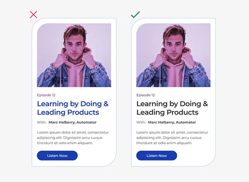
It is also good to refrain from using contrasting lines and borders and replacing them with vertical and horizontal whitespaces.
Another vital point to remember is to simplify and highlight the CTAs (Calls to Action) so that users are reminded constantly to make purchases or complete registrations.
4. Make navigation intuitive
With literally everyone using their phones to shop for products or consume media today, the need for a high-performing app has become paramount. An Upland study suggests that one out of four users quit an app for good right after the first few minutes of the first interaction.
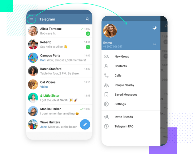
Navigation plays a key role in the performance of your app and helps the user traverse through your products, services, and other announcements and info. The presence of useful menus and search filters serves the following purposes.
- Gives visual hints – It tells the user “Where am I”
- Shows other possible directions – It informs the user “Where can I go next?”
- Provides value by giving solutions – It demonstrates to the user “What can I find when I get there?”
To this effect, businesses all over the world are paying dollars for professional UX and graphic design services to build and manage their apps. Listed below are some guidelines to follow while developing the UX of mobile applications.
- Icons and labels should be meaningful and relevant to the section they lead to.
- Put important actions and menus at the top and the bottom so that users can find them easily.
- Have a ‘Back’ button on every screen to take the user to the previous page.
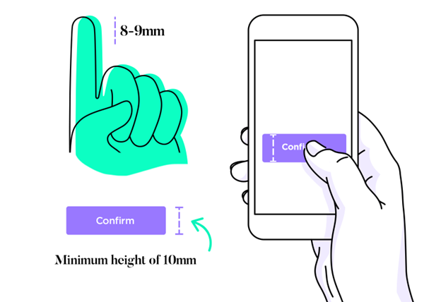
- Optimize buttons for finger and thumb positioning. Make each button at least 10 mm in height.
- The text should be legible and the background color and design should offer contrast to the characters.
- Progress and status indicators have to be included to inform the user how much time an action will roughly take.
- Excessive scrolling actions should be avoided, and be mixed and matched with swipes, and touches.
- A search option and proper filters should be provided so that users don’t have to scroll or swipe for too long.
You can get first-hand instances of great navigation features by studying the apps of renowned organizations like Facebook, YouTube, Spotify, Telegram, Amazon, and so on.
5. Make touch controls big enough
Touches in different forms like taps, swipes, drags, pinches, and spreads form the backbone of our interactions with smartphones. The tactile feedback determines the users’ satisfaction or discontent with the app to a great extent.
The fingers of users are not all of the same size, but everyone should be able to access the buttons and menus seamlessly. Nobody likes to keep tapping on an icon too small in size and difficult to open. Even if the product or information is top-notch, poor touch response will certainly have a toll on the user experience, putting all the time and hard work to waste.
Mobile interactions take place usually through thumb touch, and this needs to be kept in mind while designing the various elements. The average human fingertip is 8 to 9 mm long, and therefore, buttons, links, and menus should be at least 10 mm or 1 cm in height to be accessed by all.
6. Use clear and concise language
It is essential to use to-the-point and straightforward language in your app’s content or UX copy. No one likes to read volumes of difficult words that are irrelevant to the product and incomprehensible to the user, especially on a mobile device. The language and tone of your content can make or break your app’s performance and success. You need to get a grasp of the following factors.
Understand your target audience – For any app to succeed, you need to first determine who your users are, what their preferences and problem areas are, how long they spend on your app, what they purchased or added to their cart, and so on.
Define your voice and tone – Your language speaks of the personality of your brand. They portray the values and identity of your brand and help to build confidence in and trust among the users. Fix a voice appropriate for your target audience, and stick to it consistently. You can also seek the help of professional content marketing services to get compelling and user-engaging copies for your app.
An apt example would be the wording in the apps and websites of Casio and Omega – both being brands that sell wristwatches. While the former targets youth and adventure enthusiasts, the latter focuses on a higher age bracket and individuals willing to pay premium prices for luxury watches.
Write for clarity and consistency – The UX copy should be compact and easy to understand. Refrain from cluttering your content with too many technical terms and unnecessary text that could distract or confuse your users. Use suitable headings and subheadings, buttons, links, and menus to direct the user on what to read and where to go.
7. Use high-quality images and video
Although we have five principal senses, vision counts for about four-fifths of everything we learn and experience. Humans process visuals 60,000 times faster than text, and therefore, media containing relevant pictures and videos has a substantial impact on the written content.
Include high-definition images and videos
Today, almost every smartphone comes with an HD screen, and you need to make the most of it. Users will not take your brand seriously if your images are hazy or pixelated. HD videos also go a long way in building trust with customers.
Keep things simple
However, make sure not to go overboard with your visuals such that file sizes are too large and they take minutes to load. It is also important not to jam the screen with excessive graphic design and irrelevant elements.
Focus on accurate product images
We all enjoy the comfort of browsing for and purchasing items on our phones. That’s why mobile e-commerce solutions are high in demand these days. But at the same time, some users are reluctant to pay up-front without getting an in-hand feel of the product. This is where the product images play a key role.
Relevant images from multiple angles help in convincing the user that they will receive exactly what they saw in the app. It also reduces the hazards of repeated exchange and return requests.
8. Make your app accessible to all users
No matter how useful your product or service might be, you won’t be able to drive sales unless your app generates traffic and is available for users searching for it. App store ranking algorithms use a variety of metrics while determining how high an app ranks in response to a search.
You need to deploy first-rate digital marketing practices, such as App Store optimization, to ensure that whenever a user is looking for a product from your niche, your app is among the first few results.
Your app also needs to be present both in Google Play and the App Store to make it available to both Android and iOS users.
9. Test your app with real users
Designing an app’s UX is a creative process, with dilemmas and disputes regarding the aesthetics and layout being commonplace. To bring the best out of these questions, UX design agencies conduct A/B testing before launching the final version of an app in the market.
Also called split testing, A/B testing is a method where users are shown two or more variations of an app, in this case. These may include design elements, color schemes, typography, shape and size of buttons, and so on.
These different versions are provided to a specific group of users for a certain time period. The designers assess the users’ feedback to determine which one is performing better and should be selected as the final iteration to be made available to everyone.
10. Incorporate AI where feasible
Artificial Intelligence (AI) is spreading its influence across the technology world like a forest fire, with more companies using this technical marvel to enhance performance.
And the scene is no different in the mobile app industry. Artificial Intelligence development is being implemented effectively by app-makers worldwide.
AI has transformed the UX design process by providing more personalized interactions, lessening manual labor, and automating tedious jobs to increase business efficiency.
Here are some areas where AI has taken app development to a whole new level:
- Automated chatbot development to offer seamless solutions to issues faced by users
- Virtual AI assistants that recognize users’ voices and can respond to queries and instructions (like Siri and Google Assistant)
- Detecting potential security risks and cyber crimes through advanced machine learning
- Providing accurate and useful analytics and statistics on user interactions and preferences
- Ensuring a more customized experience by constantly updating itself according to the users’ demands.
Don’ts of Mobile UX Design
While there are certain methods you should stick to, there are also some common blunders you need to dodge while designing a mobile app. You should take care not to:
1. Make users wait for content
Loading time and navigation speed are two of the most vital attributes of any mobile app. An APM Digest survey shows that over 60% of users are likely to uninstall an app that takes more than 5 seconds to load.
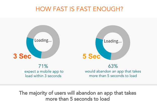
Users don’t like waiting for content and this is crucial, especially during the onboarding or registration process. You can use several techniques to speed up your app such as making your code simpler, updating third-party plug-ins, and compressing the images.
You can also lessen the latency of your app by utilizing CDNs (content delivery networks. However, it is not possible to ensure zero load times as factors like network drops are beyond your control.
It is hence essential to keep your users engaged if and when they have to wait. This can be achieved by including interactive loading screens or mini-games.
Also read: Top 10 Mistakes In Web Design For Businesses To Avoid
1. Neglect Usability Testing
Usability testing is a non-functional analysis method that evaluates in this case, an app, for user-friendliness, design, and development, and how far it is satisfying the end-user.
The ideal way to do this is to have actual users interact with your app before releasing it on the market.
It enables you to identify the pain points of your app, spot opportunities for improvement, and study the preferences of your users. The key benefits of testing your app’s usability are:
- Finding out unnoticed bugs
- Accurate and organic user feedback
- Assessment of user satisfaction
- Gaining fresh insights
- Reduce technical glitches during onboarding.
The key steps to ensure a flawless user experience test include fixing a test objective, identifying the target audience, selecting participants, collecting data, and interpreting this data to get scalable statistics and figures.
2. Ignore User Feedback
Not paying heed to feedback from users is another costly error. You need inputs from users to keep on constantly improving your app and to avoid confirmation bias, the inclination to let your personal beliefs and opinions influence your decisions.

For example, you might think that red is the ideal color scheme for your educational app as it is a vibrant color. But your users may think that it is too conspicuous and loud.
Moreover, when your customers notice that you are actively asking for their responses and putting their suggestions into practice, it builds trust and confidence in your brand in their minds.
They are more likely to recommend your product or service among their known circles. This ensures the increase of organic traffic in your app without having to spend too much time and resources.
In addition, user responses in the form of ratings and reviews are also key to the success of your app. They build up strong trust signals among people looking for your product and help your brand attain social proof.
4. Immediately ask for permissions
Asking for permission to access various features on the user’s phone is a tricky process. It is almost like a two-edged sword.
On one hand, they are necessary for the app to function. For instance, if you have an online cab service, you require the users’ phone and location to send the taxi exactly where they want to board it. But you don’t need access to their gallery or camera right up front.
Similarly, if you have a photo-editing app, you need access to the user’s gallery first, and not his phone or contacts.
Too many requests can often overwhelm and distract the user. It’s like asking someone to share every single personal detail in the very first place. In either case, you need to build trust in the beginning.
It is important to know which permissions to ask for in the beginning and the timing and context of more such requests in the future. The following study by Google segregates permission requests into critical and secondary.
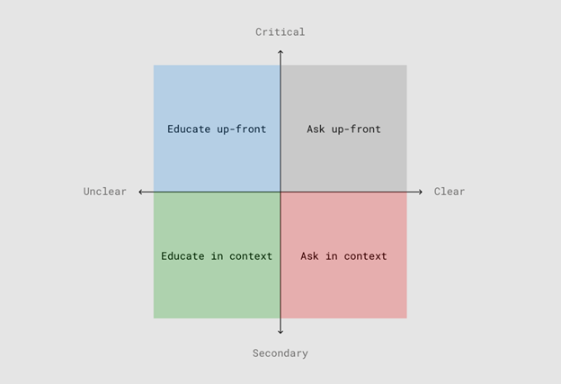
Critical permissions, just as we saw in the cab-service app example, should be requested right at the beginning as they are essential for the app to be able to do what it’s supposed to. However, secondary permissions should be asked for only when the app needs them to function.
Hope to hit the jackpot, the very first time
It is almost certain that the first UX design of your app will not be flawless and start working smoothly. It will definitely not be the final design that can be made available to users. Chances are that it will contain multiple bugs, glitches, and hiccups.
And that is perfectly fine!
The best Mobile app developers know this, and this is why they follow a feedback loop while building apps. The objective is to quickly develop a prototype or MVP (Minimum Viable Product).
This prototype is shared with stakeholders and users and then evaluated on the basis of performance and user feedback.


